Privy provides a 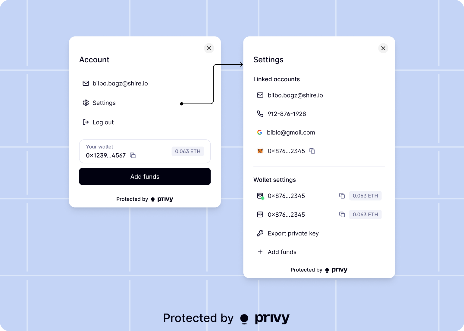
UserPill component to easily embed in your application. Users can login or connect their wallet from the user pill. Once authenticated, users can interact with the pill to quickly view their account information and use their wallets.Usage
To use the user pill component, import from the@privy-io/react-auth package:PrivyProvider:Customizing via props
Privy allows you to easily customize the user pill within your app by passingaction, label, and/or size props on the component.Action prop
The action prop describes the action the user can take from theUserPill component. This prop is an object with a type and options field.You can set the type to:'connectWallet'to guide the user to connect their wallet. Iftype: 'connectWallet'is set, you may setoptions: {description?: string}to provide a description for the wallet connection prompt.'login'to guide the user to login to your application with any of your configured login methods. Iftype: 'login'is set, you may setoptionsto an object containingloginMethodsand/orprefill. TheloginMethodsfield contains an array of the login methods to use in the pill and theprefillfield contains an email address or phone number to prefill into the Privy login modal.