> ## Documentation Index
> Fetch the complete documentation index at: https://docs.privy.io/llms.txt
> Use this file to discover all available pages before exploring further.
# UI components
> Pre-built UI components for wallet funding, sending, and receiving in React applications
Privy comes with out-of-the-box UIs for signing messages and sending transactions.
These wallet UIs are highly-customizable, allowing your application to communicate relevant context to the user or abstract away the fact that a wallet is being used under the hood.
## Sign message
Below is a sample message signature UI.
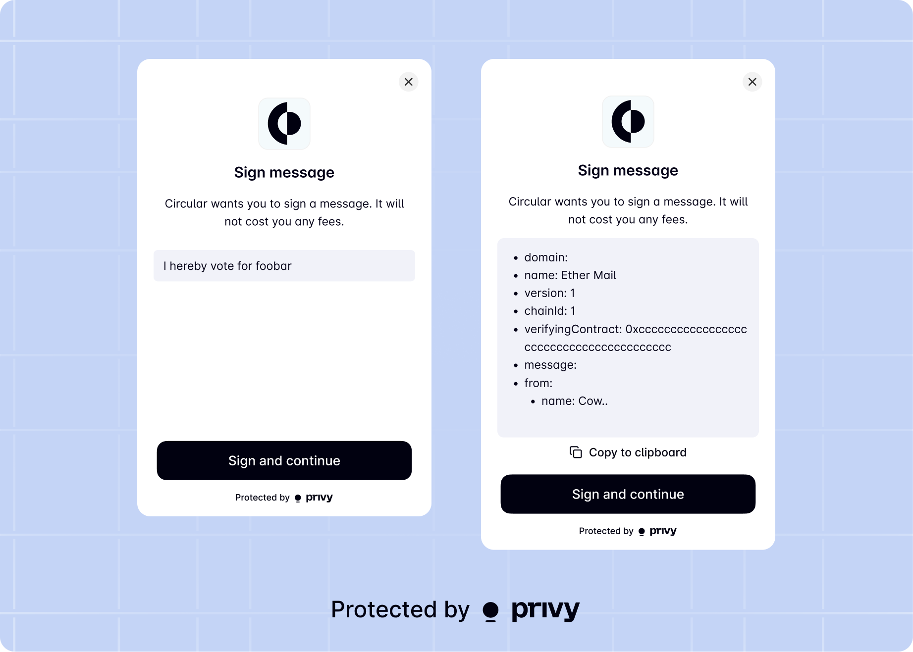 This UI can also be customized by passing a `uiOptions` object of the following type to the method.
### Parameters
Whether to overwrite the configured wallet UI for the signature prompt. Defaults to `undefined`,
which will respect the server-side or SDK configured option.
The title text for the signature prompt. Defaults to 'Sign message'.
The description text for the signature prompt. Defaults to 'Signing this message will not cost you any fees.'.
The description text for the signature prompt. Defaults to 'Sign and continue'.
## Send transaction
Below is a sample transaction UI.
This UI can also be customized by passing a `uiOptions` object of the following type to the method.
### Parameters
Whether to overwrite the configured wallet UI for the signature prompt. Defaults to `undefined`,
which will respect the server-side or SDK configured option.
The title text for the signature prompt. Defaults to 'Sign message'.
The description text for the signature prompt. Defaults to 'Signing this message will not cost you any fees.'.
The description text for the signature prompt. Defaults to 'Sign and continue'.
## Send transaction
Below is a sample transaction UI.
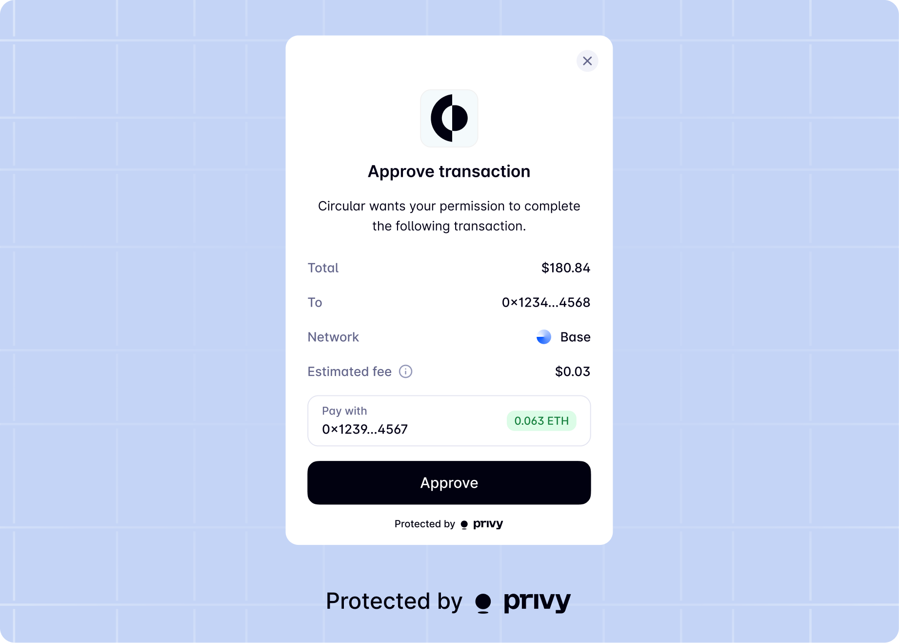 This UI can also be customized by passing a `uiOptions` object of the following type to the\
method.
### Parameters
Whether or not to show wallet UIs for this action. Defaults to the wallet UI setting enabled for your app.
Description of the transaction being sent.
Text to show on CTA button for Send Transaction screen. Defaults to 'Submit' or 'Approve'.
Title for transaction details accordion.
Short action description (e.g., 'Buy NFT').
Smart contract information URL.
Smart contract name.
Contract image URL.
Alternative text for contract image.
Image size for contract ('sm' or 'lg').
Text displayed at the top of the success screen. Defaults to 'Transaction complete!'.
Description for the success screen. Defaults to 'You're all set.'.
Whether to display a cancel button on the confirmation screen.
When building an application using the React Native SDK, Privy gives you complete control over
the experience and UI.
If you do with to use Privy's default UIs for message signing or login, make sure you have
[properly configured `PrivyElements`](/basics/react-native/advanced/setup-privyelements), and
use the hooks exported from `@privy-io/expo/ui`, such as `useLogin`, `useSignMessage`, or
`useFundWallet`.
The React Native SDK does not yet support default UIs for signing typed data or sending
transactions. Consumers of the SDK typically attach their own UIs to the Privy SDK methods for
signing messages and sending transactions
| Use case | Hook |
| ----------------------- | ------------------------------------ |
| Login users | `useLogin` |
| Sign message (Ethereum) | `useSignMessage` |
| Sign message (Solana) | `useSolanaSignMessage` |
| Fund wallets (Ethereum) | `useFundWallet` |
| Fund wallets (Solana) | `useFundSolanaWallet` |
| Enroll in MFA | `useMfaEnrollmentUI` |
| Verify MFA | Set `enableMfaVerificationUIs: true` |
This UI can also be customized by passing a `uiOptions` object of the following type to the\
method.
### Parameters
Whether or not to show wallet UIs for this action. Defaults to the wallet UI setting enabled for your app.
Description of the transaction being sent.
Text to show on CTA button for Send Transaction screen. Defaults to 'Submit' or 'Approve'.
Title for transaction details accordion.
Short action description (e.g., 'Buy NFT').
Smart contract information URL.
Smart contract name.
Contract image URL.
Alternative text for contract image.
Image size for contract ('sm' or 'lg').
Text displayed at the top of the success screen. Defaults to 'Transaction complete!'.
Description for the success screen. Defaults to 'You're all set.'.
Whether to display a cancel button on the confirmation screen.
When building an application using the React Native SDK, Privy gives you complete control over
the experience and UI.
If you do with to use Privy's default UIs for message signing or login, make sure you have
[properly configured `PrivyElements`](/basics/react-native/advanced/setup-privyelements), and
use the hooks exported from `@privy-io/expo/ui`, such as `useLogin`, `useSignMessage`, or
`useFundWallet`.
The React Native SDK does not yet support default UIs for signing typed data or sending
transactions. Consumers of the SDK typically attach their own UIs to the Privy SDK methods for
signing messages and sending transactions
| Use case | Hook |
| ----------------------- | ------------------------------------ |
| Login users | `useLogin` |
| Sign message (Ethereum) | `useSignMessage` |
| Sign message (Solana) | `useSolanaSignMessage` |
| Fund wallets (Ethereum) | `useFundWallet` |
| Fund wallets (Solana) | `useFundSolanaWallet` |
| Enroll in MFA | `useMfaEnrollmentUI` |
| Verify MFA | Set `enableMfaVerificationUIs: true` |